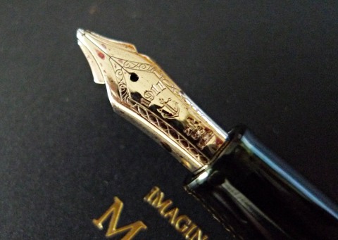
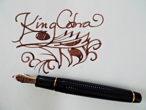
Sailor’s Nagahara specialty nibs are feats of engineering, and just like other feats of engineering, like bridges and giant tangles of metallic modern art in parks, Â sometimes they look mighty weird. Take, for example, the King Cobra.
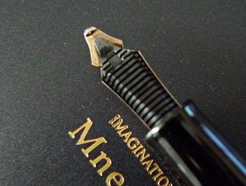
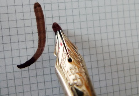
The King Cobra is actually two nibs. The bottom nib has a very wide tip, the upper nib one slightly narrower, coming to a rounded point.
Viewed from behind, the nib reminds me of a pharaoh’s cap, neatly crowning a black plastic feed. (Hey! Pharaoh -> Cleopatra -> asp -> cobra! Okay. I’ll stop now.)
This is a nib I wish were installed in a piston filler, because the poor converter holds barely enough ink for a day. The nib also flexes. But why I would flex it, when it is clearly at least a 6B, is like asking why pop a snake in a rope jar and make it dance to Bollywood pop.
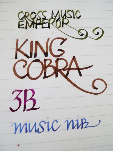
If you’re looking for line variation, the King Cobra is not for you. I would suggest the King Eagle, or even the Cross Music. The King Cobra lays down a consistent-width, wet line.
Aside from having the boldest signature on the shareholders’ minutes, you can also doodle large, shade with impunity and strike fear into the heart-shaped breather holes of medium nibs.
