Friends, hoarders, creatures of habit, lend me your fears. I have come to compare Sanzen Tomoe River paper with the original Tomoe River, and the good news is – it’s a solid performer. You’ll find similarities between my thoughts and the Gentleman Stationer’s first impressions, and also a couple of differences. That’s because I am no gentleman. (Badum-tish.)

Compared to OG TR, Sanzen TR:
• Has more tooth
• Lets liquid soak through faster (but the sizing helps retain the liquid within the fibers, resulting in less show-through on the other side)
• Copes a little less valiantly with wet-in-wet techniques
• Resists ink lifting just a touch more


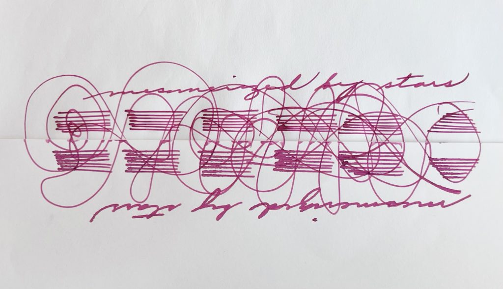
There are inks that seem to form harder, more obvious edges on Sanzen TR (especially those with many dye components). Others register more intensely.

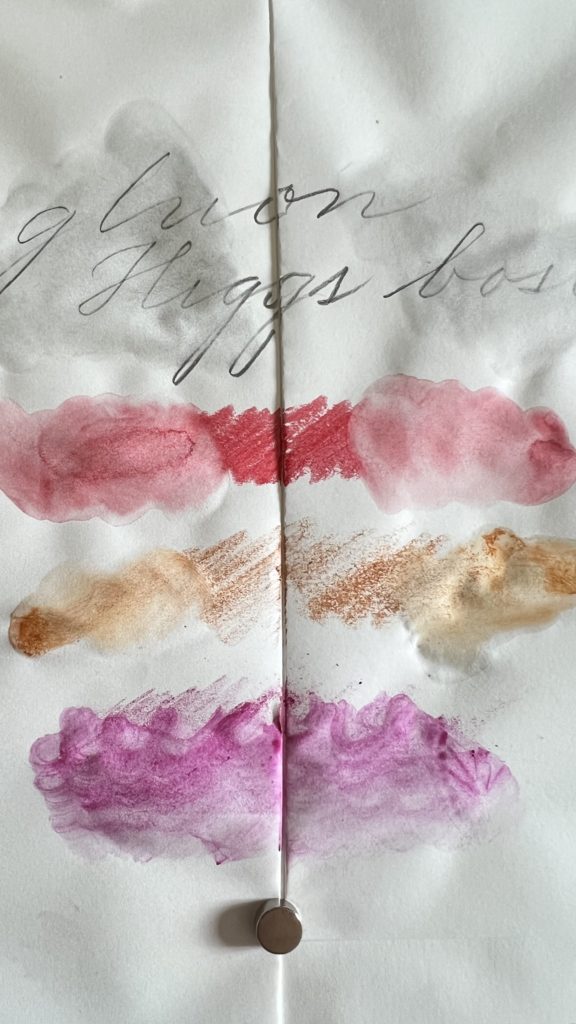
What does “a little more tooth” mean in use? It means Sanzen TR paper feels like inkjet paper, or a smoother brown bag. A lighter touch definitely helps; my hand is already quite light, and I still feel the difference, but not to the extent that it intrudes. I’m sure it’s a feeling that will become familiar with time. For those of us who use OG TR for ink-extravagant doodles and washes, what can be more tricky is managing different layers of ink and dry times. Sanzen TR feels mushy after two layers. It’s not that obvious when dry, but if you’re used to taking your cues from the feel, where your brush or nib contacts the paper, then you need to adjust. Wait a little longer in between washes.
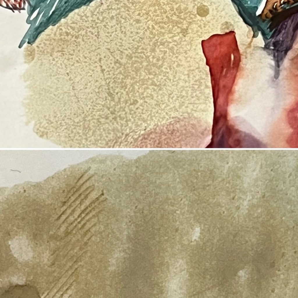

I would appreciate other eyes on one other observation I have, which is that certain dyes seem to be more intensely showing up on Sanzen and that leads to an overall slightly warmer tone.

It would be a lovely paper on its own were it not burdened with a brand name that comes with set expectations. If you like Cosmo Air Light but would prefer a slightly crisper, thinner version that resists feathering, then Sanzen TR could be your new favorite.
Bottom: Cosmo Air Light
I could not resist trying out my inks du jour, Pilot Tsuwairo Black and Blue-Black, on both papers. For a little more consistency, I used the same SEF nib. Here, OG TR shines. Pigment ink is already a challenge for most kinds of paper. (Glares at Platinum Carbon Black, my forever ink.) OG TR preserves the expressiveness of stroke even with pigment inks, which is what I prefer. But for fans of blackest black, Sanzen TR pulls ahead.

Bottom: OG
If you want to try Sanzen Tomoe River, along with other happy paper (Kinkakuden super white wheeeeee), Yamamoto Paper ships from Japan to most anywhere.