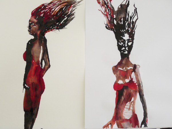
Artists always play with the relationship of medium to ground. Pastel on brown wrapping paper, silverpoint on gesso, ink on parchment, spray acrylic on brick. Pastel artists use toned backgrounds and colored paper to add body and contrast to what is really just powder hanging on to microscopic protrusions, for dear life and art.
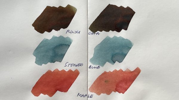
It doesn’t come as a surprise, then, that fountain pen ink behaves differently from one kind of paper to another. There’s a lot involved – sizing, fiber composition, many kinds of white, off-white, cream.
Here’s a look at Noodler’s Antietam and X-Feather on Mnemosyne paper. Mnemosyne paper is very, very smooth. It also appears to have some kind of sizing that helps the paper resist absorbing a lot of ink all at once – that’s why you see lighter and darker blotches of Antietam. X-Feather’s formula is slower-drying on its own, because it is meant to resist feathering. You can see how wet it remains, even as Antietam is almost dry.
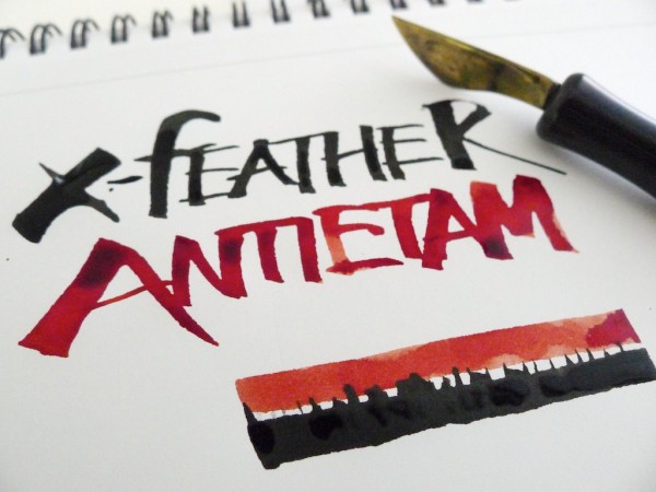
Here, I used the same inks on Letraset marker paper. Marker paper resists bleedthrough and has a very smooth, almost silicone-silky surface. Alcohol-based markers like Copic and Letraset Tria blend very easily on marker paper. Fountain pen ink stays on top, doesn’t dry quickly, and when it does dry, sinks in so well that it can’t be lifted and rewetted. Demarcation lines are obvious. (Also, through this experiment, I found out that X-Feather actually granulates.)
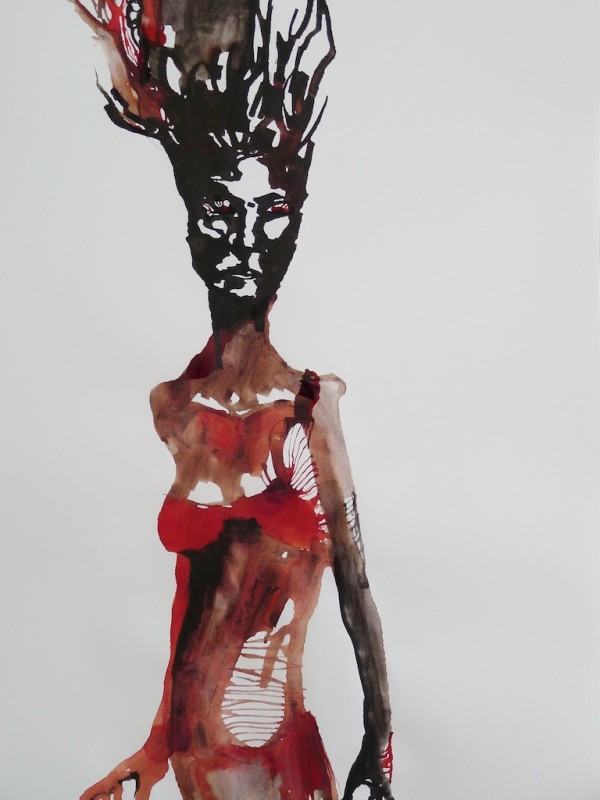
One of my favorite papers is Fabriano sketch paper, and unfortunately Fully Booked no longer seems to stock it. This is off-white, very pale cream. Because it’s meant for sketching, the paper has texture. It absorbs ink more quickly, but it also lets the ink be rewetted and spread after it’s dried. Both Antietam and X-Feather appear darker and richer on this paper compared to the Letraset.
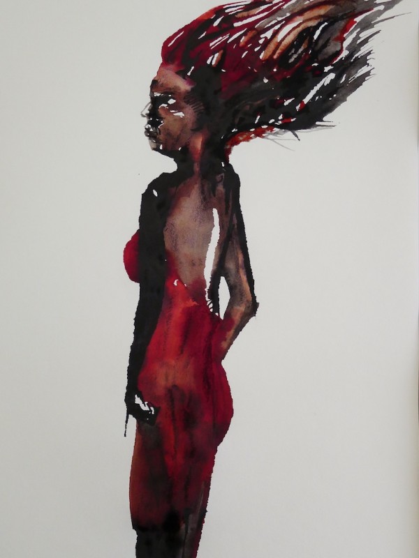
Certainly you get the side-by-side comparison, because I am in advertising and we do such things.
