If you can gauge a pen by its name, then this pen has to be a heavy hitter. You can’t tell by the way it looks, though. The name refers to the nib, not to the body. A nib that deserves three nouns should be able to do anything short of tweeze eyebrows and squeeze juice from wheatgrass.Â

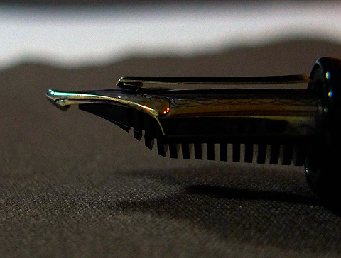
The nib is actually two nibs. There’s a metal strip on top that acts as an overfeed, pushing more ink to the nib. Sailor’s Emperor nibs all have the overfeed.

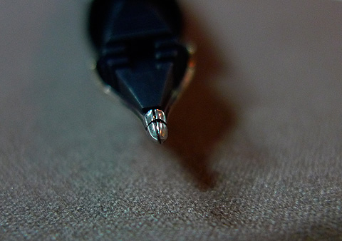
The “cross” in the name refers to the way the two nibs are slit. Usually, a single nib has a vertical slit. Here, there’s a horizontal slit as well. The cross cut allows more ink delivery to the paper. The iridium tipping is shaped so that when almost flat against paper, the nib delivers a very wide horizontal line and a thinner vertical line. That’s the way Sailor defines “music nib” in this case. Their regular flavor music nib is a stub with a single slit, not the three-tined design Pilot and Platinum have.

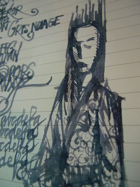
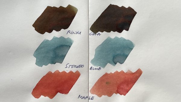
I think a Cross Music Emperor deserves a Cross Music Empress, and here she is, looking suitably cross. Watery, pale inks that look washed out in finer-nibbed pens come to life with a nib like this. On sturdy paper, thin lines can add texture over broad washes, something a regular nib could never accomplish.


