Venture deep enough into any rabbit hole – coffee, wine, watches, audio, pens, 3D printing – and you find yourself sweating the small stuff (“…but with this setup I get 22.8% TDS instead of 21%…”), exchanging hard currency for knowledge currency (“I need to compare the Moondrop Blessing 3 to the Campfire Andromeda Emerald Sea, so I’ll just get both and sell the one I don’t like as much…”), and, to no one’s surprise but yours, crossing over from Enthusiast to Enthusiast with a Second Instagram Account Dedicated to Watches.
I mention this, not in passing, but with bemused affection. Most people don’t even know what a nib is. But show up at any pen meet or show today, and it’s obvious that specialty nibs and nib services are having a moment. Certainly they have always been around, but never at this level of availability and interest. What used to be primarily a Japanese domain (Sailor specialty nibs, Pilot’s FA, WA, PO, Platinum and Nakaya’s stretch from elastic SEF to Music) is now on offer for multiple brands.
What are you writing with your JoWo BB ground into a Kodachi? Is that needlepoint, extra-fine SIG, ultrasuperduper 0.19 your planner gamechanger? How stacked is your stacked nib? Is there enough cursive in your italic? How do you discover enough about what your hand likes, what you enjoy seeing on paper, to brave the explosion of options?
In this, as in many other worthwhile pursuits, there is no better instructor than curiosity and attentive inquiry. Why do some pens feel better than others? What does “better” mean to you? How loose or tight is your grip, where is your little finger, is your shoulder hitched up or relaxed?
Attentiveness tastes best with coffee, of course, and Nina made sure I was deliciously supplied as I sat across Matthew, Honorable Son and Nib Armorer, discussing options. The 2023 San Francisco Pen Show pre-registration for nib work filled up even before the show, except for day-of signups, which was the usual for Mike Masuyama (Mike It Work) and Matthew Chen (Matt’s Nib Works). At the Manila Pen Show earlier this year, the room designated for nib services was always packed, with JP, John Lim, and Sunny Koh scarcely getting up from their tables.
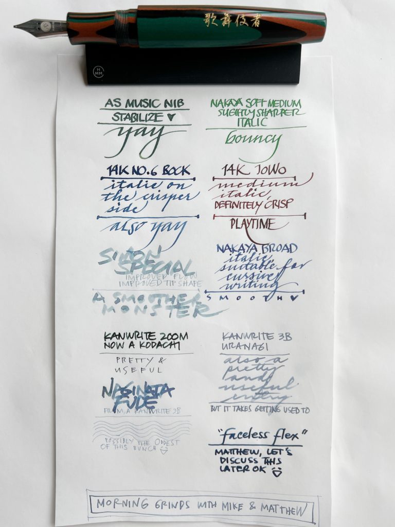
By paying attention to how you write or draw, you become more sensitive to the different effects you can coax out of a specialty nib. (I realize many people want their handwriting or block print to look better without extra effort, and certainly getting a cursive italic or an architect grind can mostly get you there, but understanding why it looks better can be helpful for future nib adventures!)
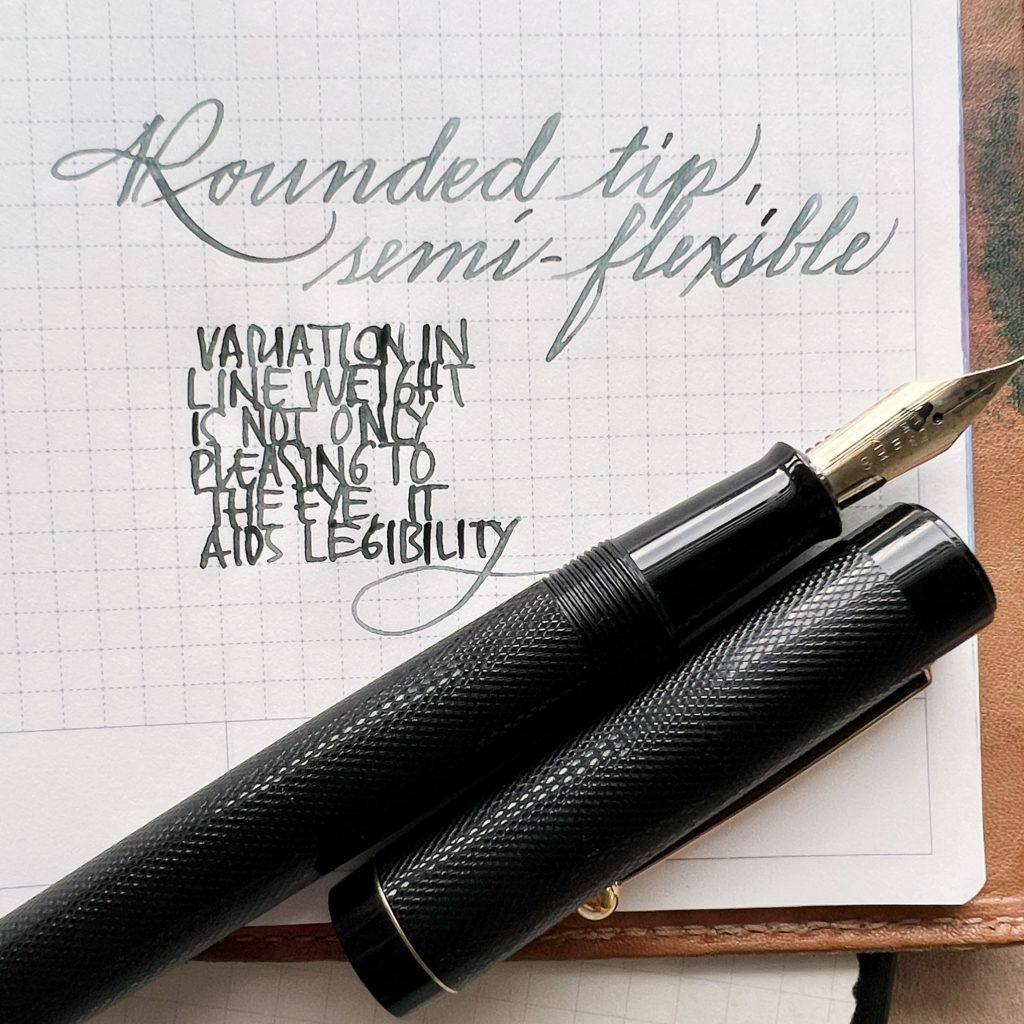
The rounded tipping usually found on regular nibs (marked extra-fine to broad) produces a monoline. Our eyes are used to this monotonous line weight because of ballpoints and rollerballs. Most readily available nibs are monoline, and sheening or multi-chromatic inks are what add interest to the letters.
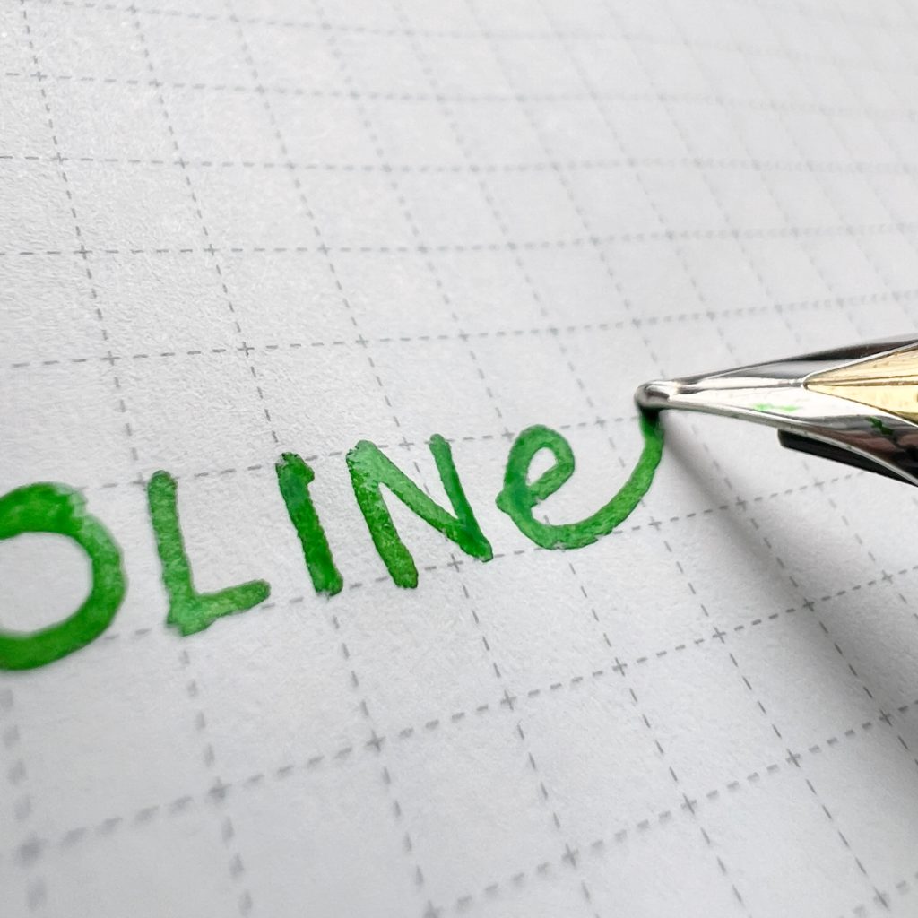
Much of digital typography is monoline – the app names we see on our home screens a hundred times a day are just a single example of this prevalence – but this seeming simplicity is not necessarily easier to read.
Our brains like having many points of difference to help in recognition and retrieval; I think this is why line variation is both pleasing and useful.
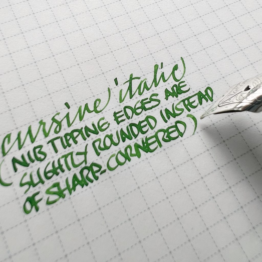
Broad edge nibs are readily available and suit many writing styles. Highlighter pens qualify as broad edge, as do school italic pens (like Manuscript), stubs and music nibs, the 1.1 and 1.5 stock TWSBI nibs, even Sharpie chisel tips. I learned italic with a Stabilo highlighter. Artline makes calligraphy felt-tipped pens with various line widths. Pilot Parallel Pens have two plates enabling capillary action, and get the job done for many professional calligraphers. And of course, there’s the bespoke option. Italic grinds can range from exacting to forgiving, with much of that range coming from edge roundness.

The heavier your hand, the less “smooth” a sharp italic will feel. Conversely, a light hand can glide over paper even with a sharper italic. Nib rotation can affect the perception of smoothness, as well as the slope of the letters. (A caveat: my observations come from being a right-hander. Left-handed writers will most likely need to adjust their grip to use a broad edge, or try a right oblique grind that favors their nib rotation.)
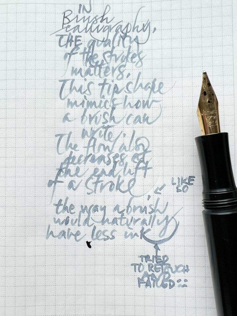
Humans will use what is at hand. Our ancestors pressed cut reeds into clay, chiseled letters into rock, harvested feathers from fowl and skin from goats and gall from oak, engraved bamboo cylinders, and all sorts of crazy ass giant cerebellum shizzle. Who was that human who looked at the backside of a horse and thought, hey, I could write letters with that?
Anyway, that’s why we have nib grinds meant to emulate the sensitivity of brushes. Why go to the moon? Because it’s there.
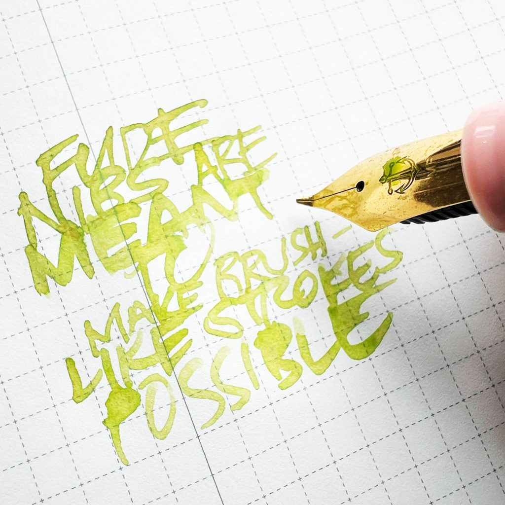
Metal nibs last longer than brushes, and for people who grew up bearing down on surfaces with stylii and ballpoints, don’t require as light a hand. Bending a nib to recreate a brush-like stroke was a stroke of genius (I COULDN’T RESIST), because it made commercial sense. Sailor has two models of its entry-level fude de mannen pen, a 55º and a 40º, with the degrees corresponding to the angle of the bent nib. The barrel is also longer to accommodate a brush grip, with the pen almost vertical to the paper.
I wouldn’t recommend a fude nib to be your sole writing nib if your default is cursive – it can get tiring to use it at the higher angle with a running hand. If you like block printing, and draw or doodle as well, it might work as a primary pen. Chinese brand pens also feature bent nibs, and could be worth looking at too.
Every hobby has “The One Thing.” “This grinder can do everything from pourover to espresso.” “These in-ears provide excellent noise cancellation in real-world environments AND insightful, balanced sound.”
That exists in the pen world, too. “With this nib grind, you can mock up band posters for concerts as well as to-do lists for ants.” Oddly enough, you end up accumulating many of these “The One Thing” nibs, which defeats the purpose, really, but, as long as you’re happy.

refined by Yukio Nagahara twice (2007, 2019)
Sometimes, I think we use performance indicators (7/10 inkflow, fine cursive italic on the reverse with up to 6 mm wide wet strokes with a low angle to the paper) as ways to rationalize our happiness in advance. Perhaps it takes more to make us happy when we know more of what’s out there and what we could possibly have? I wonder about that – about how all I had to draw with were hand-me-down pencils on the insides of cigarette cartons, and I didn’t know there were such things as shimmer ink and humidity-shocked paper.

Writing by hand, as an embodied, analog expression of intent and intelligence, could be the modern human’s middle finger to the forces of convenience, commoditization, and commercialization of creativity. It is at once personal yet for others; a writer can write for their own eyes, but in a language that is a social construct, that can be interpreted by others. Why not, then, make the act of writing as special as possible? That might not be as easy to deepfake.

“Typography exists to honor content.” – Robert Bringhurst
From The Elements of Typographic Style
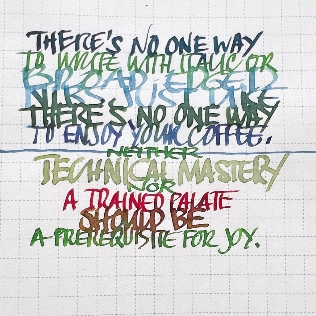
Specialty nibs exist to honor your thoughts, to render your creativity legible, to shape your letters and lines in a way that surprises and satisfies your eyes. Go to a pen show, attend a pen meet, try a few, and don’t forget to pay attention.
“Attention is like energy in that without it no work can be done, and in doing work is dissipated. We create ourselves by how we use this energy. Memories, thoughts and feelings are all shaped by how use it. And it is an energy under control, to do with as we please; hence attention is our most important tool in the task of improving the quality of experience.” – Mihaly Csikszentmihalyi
From Flow: The Psychology of Optimal Experience


