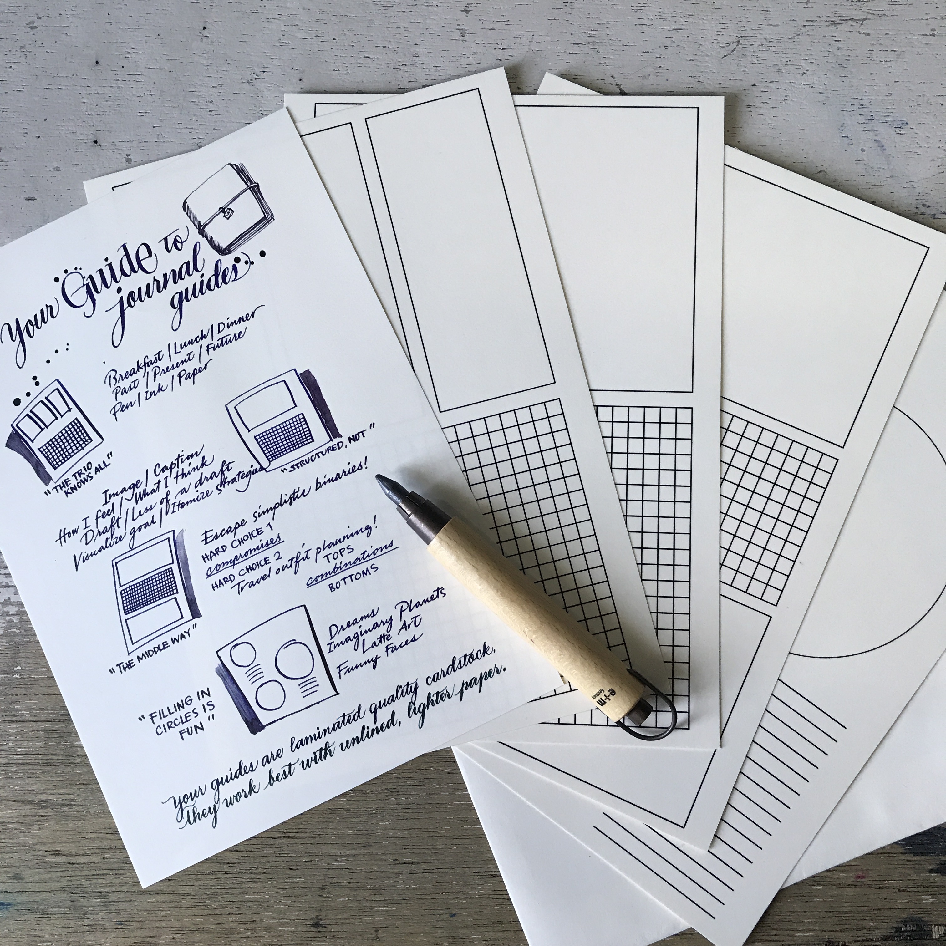
UPDATE:
A5 Journal Guides are available at Common Room (for Manila-based peeps) and now online at Vanness! You get a suggestions sheet, and four guides printed on thick, high-quality, laminated cardstock. (I can try other materials in the future, but this feels better under a thin sheet, for some reason.)
And now on to the original blog post:
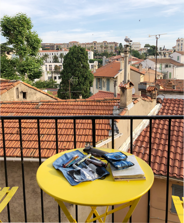
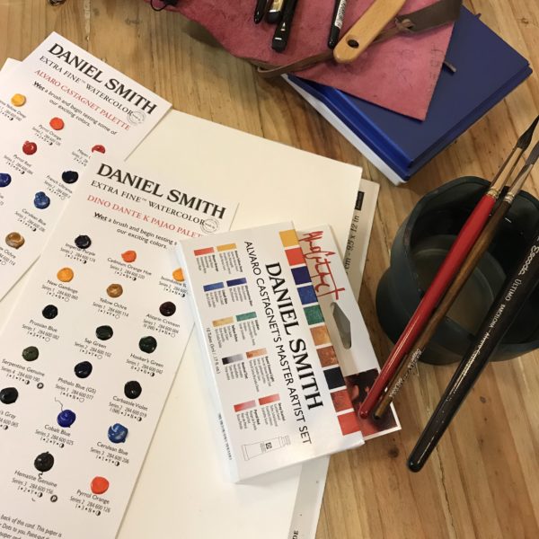
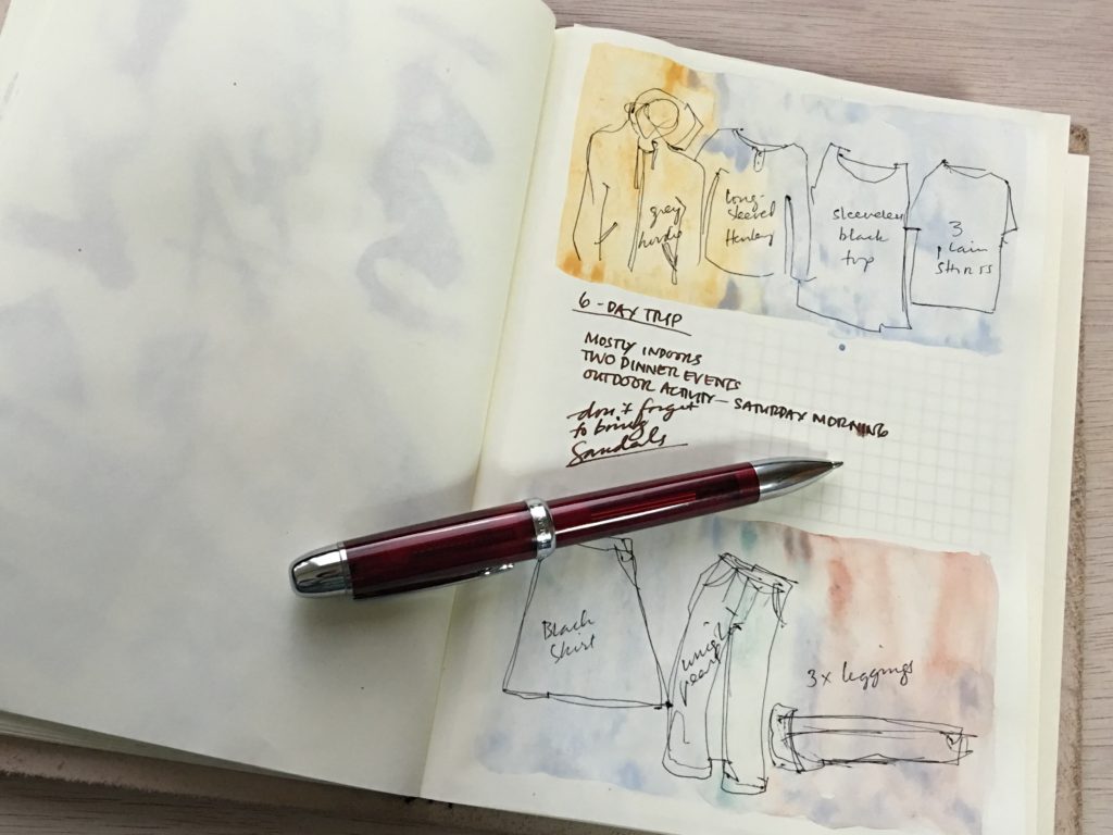
The blank page. Intimidating, yet full of hope. I’m a fan, but understand how intimidating emptiness can be. My usual coping mechanism is to hazard a beginning – ink spatters, a dash of watercolor, smudges of graphite, the word “the” – and then the rest settles into place.
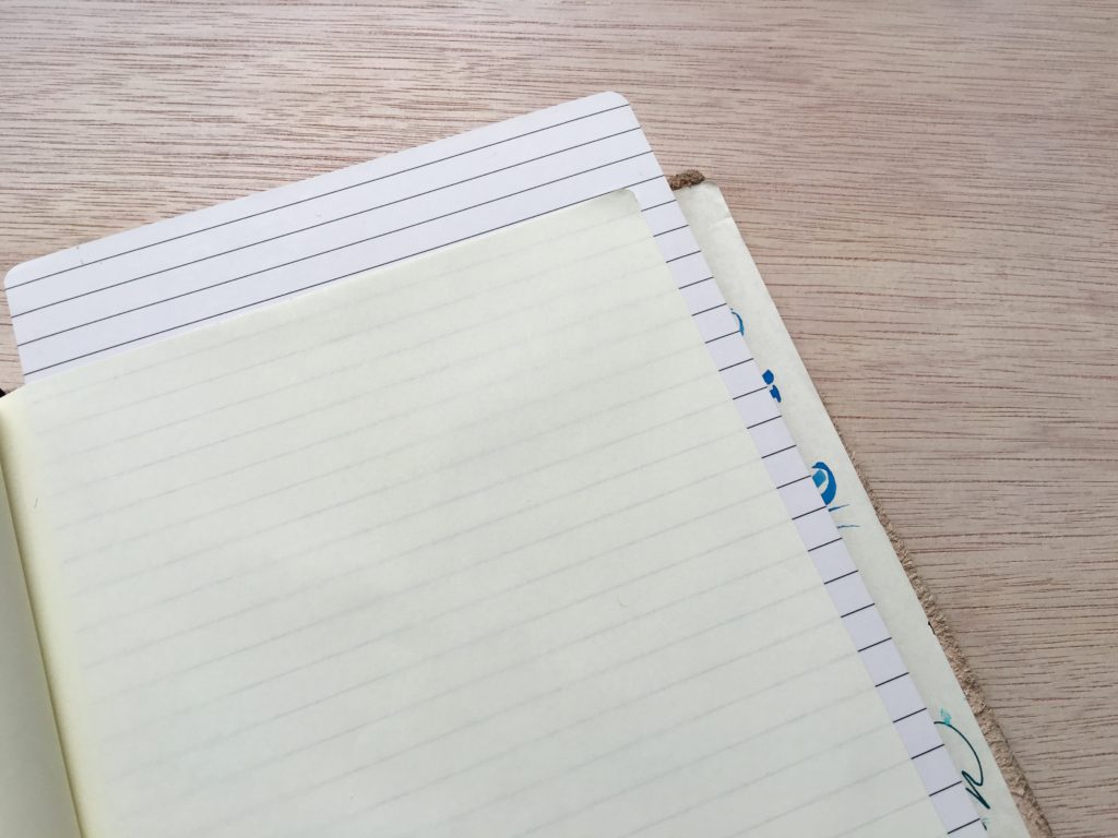
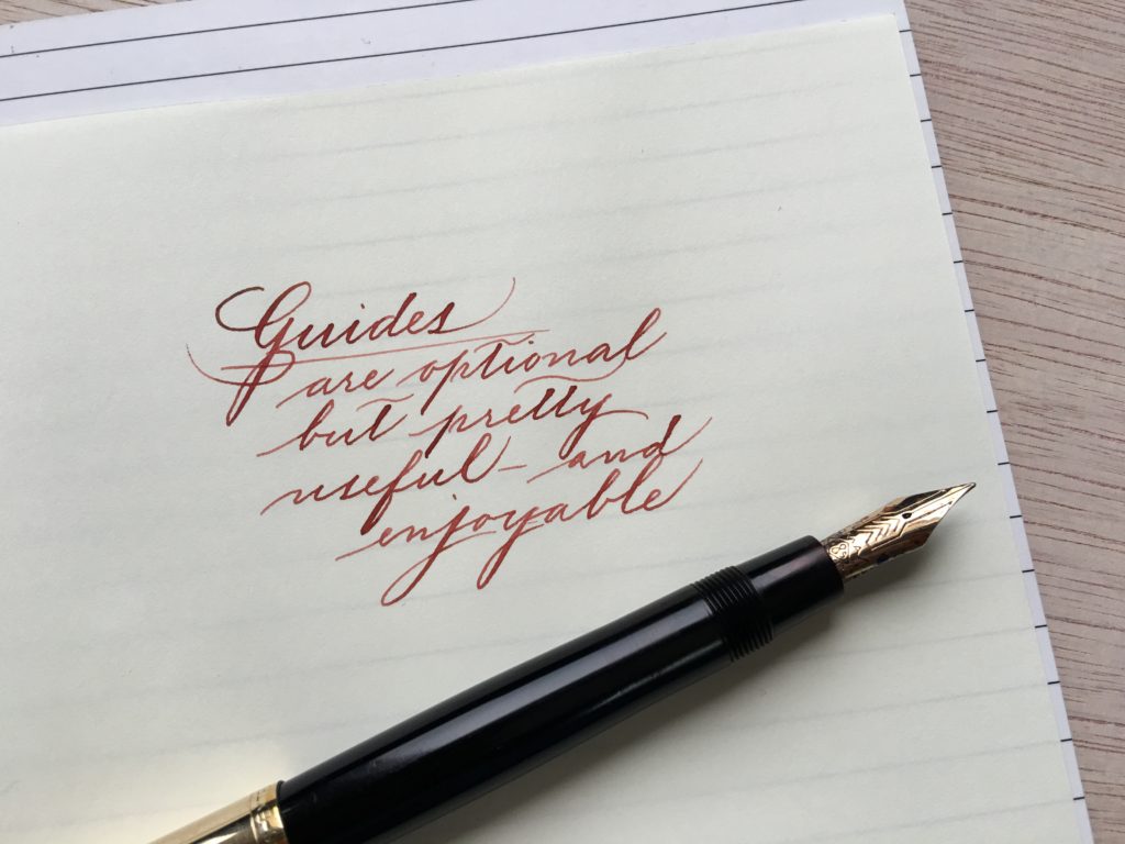
Guides exist to neaten handwriting and provide order, with lines and grids.
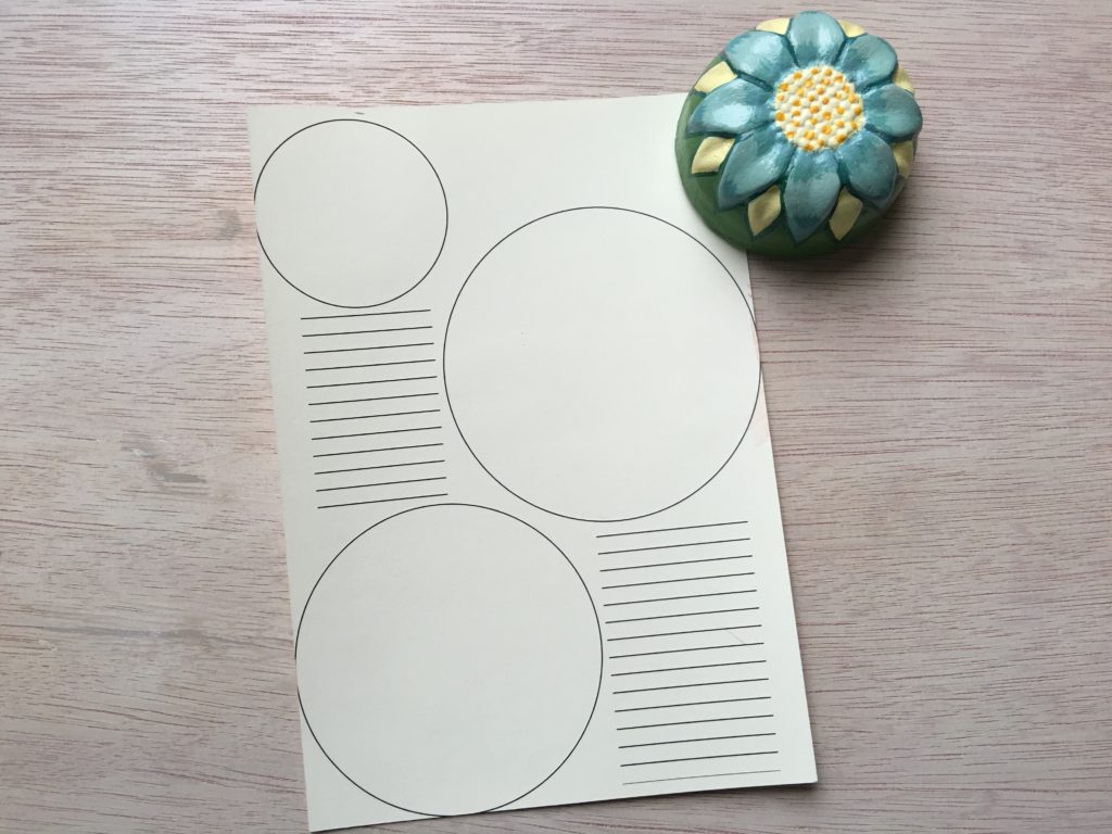
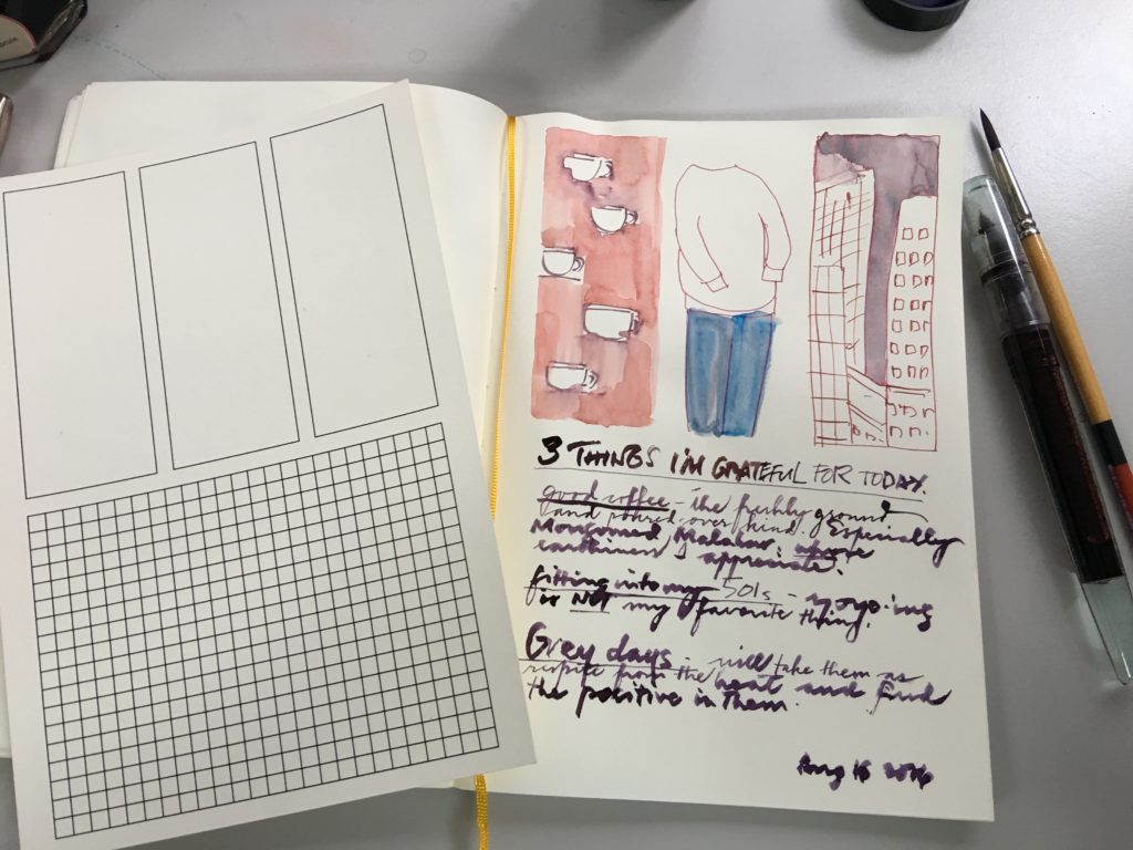
This guide is based on the three-card spread. Past, present, future. Physical, emotional, spiritual. Maiden, Mother, Crone. Do this, do that, do nothing. Short-term, mid-term, long-term goals. Three things I’m grateful for.
JOURNAL GUIDE: THE MIDDLE WAY
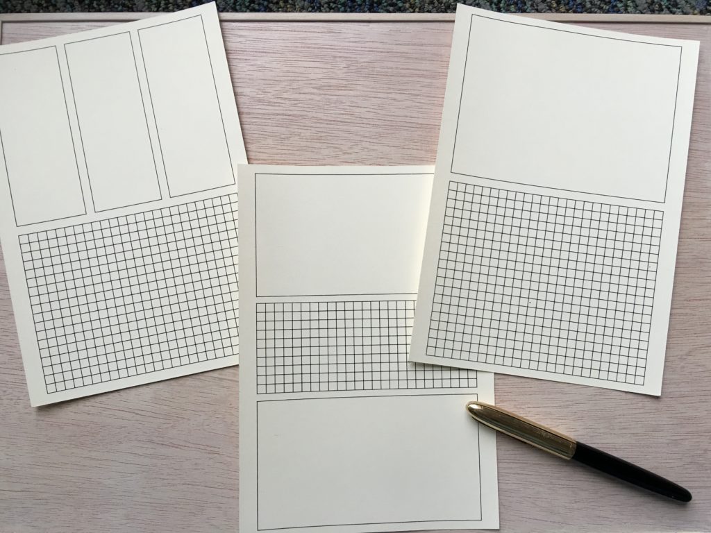
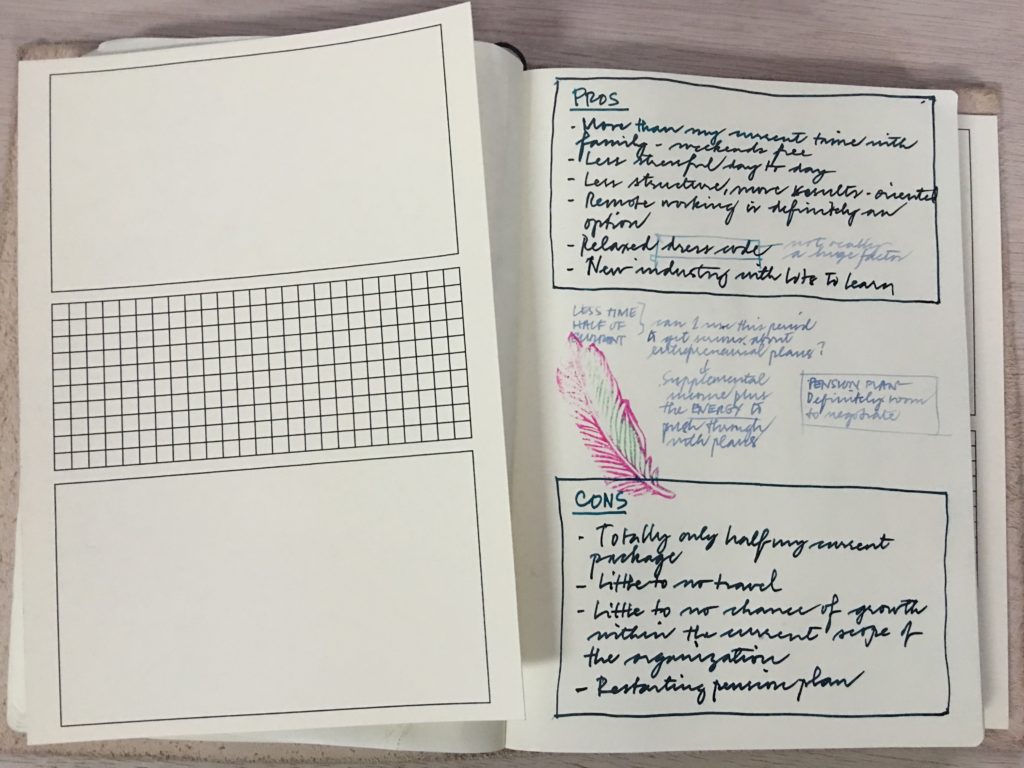
This guide is meant for richer pairing and comparisons. Here’s what a pros-and-cons process looks like. The middle space encourages actively searching for points where pros and cons can meet or be resolved differently.
The postcard layout just divides the page into structured and free-flowing.
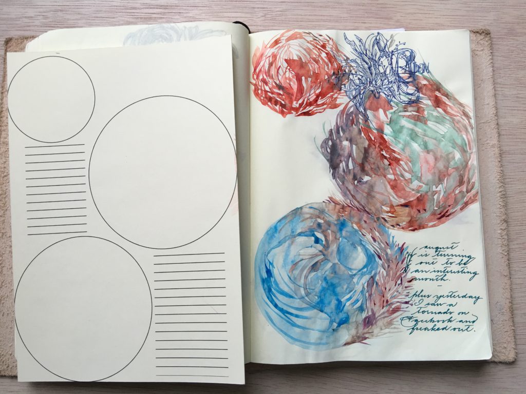
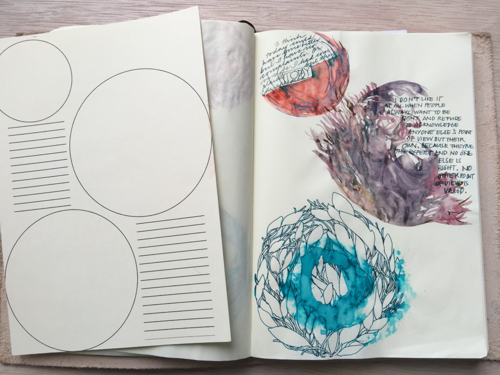
Let’s go back to the silly guide, the one with circles. As it turned out, this was the most conducive to doodling.
(Thanks to Jake and Marnie for helping me with the prototypes!)