The only good Waterman is a vintage Waterman, unless it’s a Carene with a factory stub, or a Serenité with a cursive italic by Mike Masuyama.
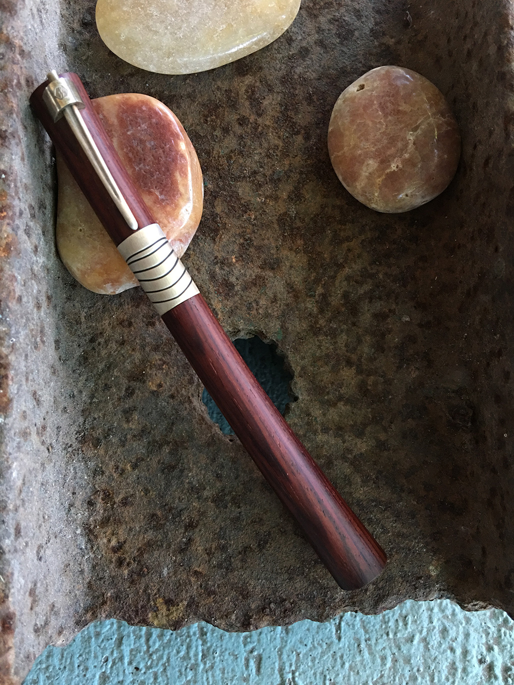
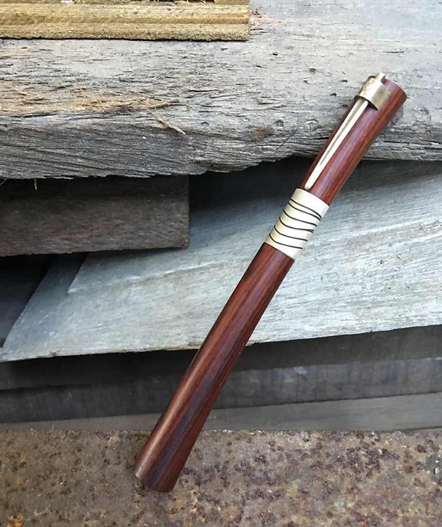
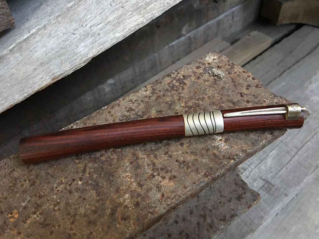
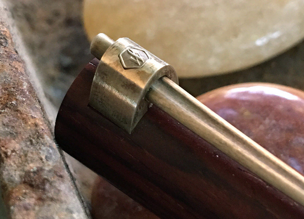
The Serenité is an anomaly in the modern Waterman portfolio. Discontinued but still available in a few shops or from online and show vendors, it was the first pen design that startled me into an awareness of what a cylinder could become. It was how a sword could dream of itself: a fell swoop of deadly elegance. It came with a stand, where it could rest in between confrontations with ink and paper.
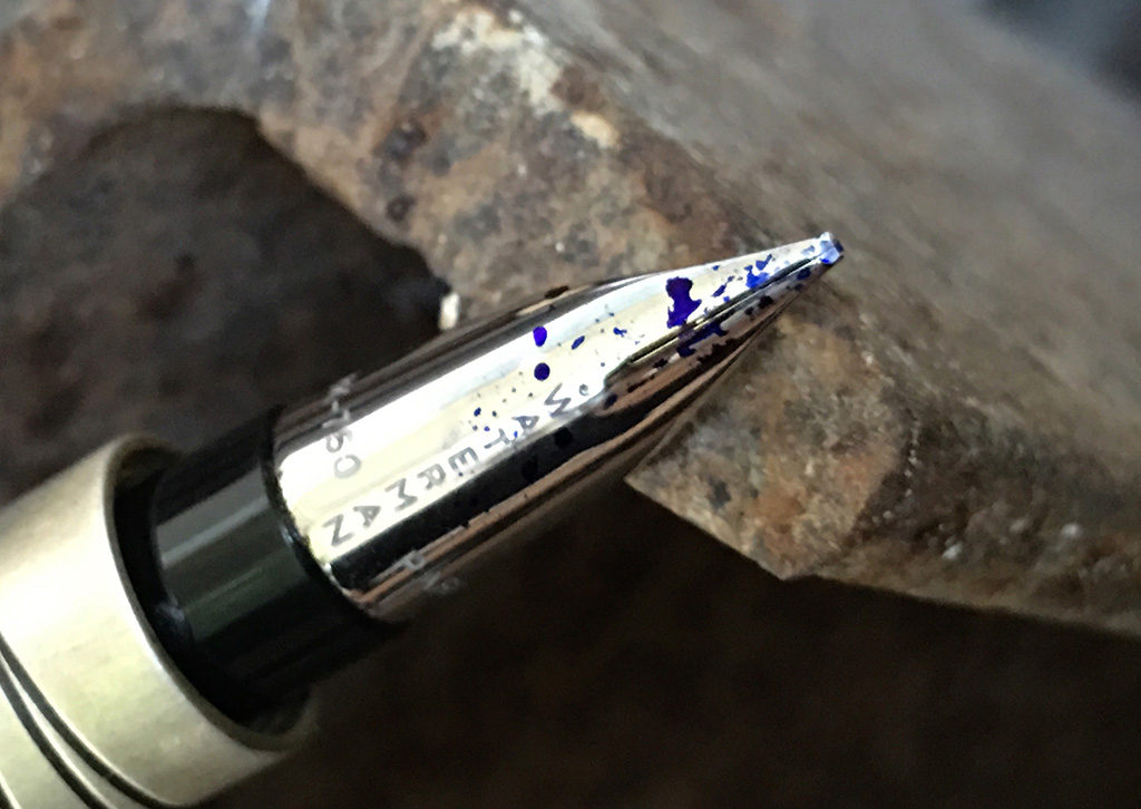
My big issue with modern Waterman pens has nothing to do with what they look like and everything to do with the nails they pass off as nibs. This is why the only modern Waterman nib I like is a stub. The Serenité, like many modern limited editions, came with the most expressionless of medium nibs.
But it was a pen show, and more importantly, it was a pen show that featured Mike Masuyama. So off the pen went, to wait in his queue for its turn to be transformed.
Like inky water circling a drain, pen people inevitably fall for a type of pen, a theme if you will. There is also, usually, a Grail Pen, or Grail Pens, that embodies the theme in its essential glory. I avoid grails (although I’ve been known to joke about a pen or two in this regard). Such an exalted level of expectation almost guarantees the pen will not meet it. (This works for people, too.)
The Cocobolo Serenité was never in any danger of high expectations from me, and so has been free to be the comfortable, easy writer it actually is. It doesn’t perch on the stand. It stays in the Nock Co. Brasstown with all the others, ready to spill Pilot Blue Black when called to active duty.

Waterman released this version of the Serenité in 2002, which means this pen had to wait 14 years to come to Manila. I’ll make sure to put it to good use. 😉
PS. I see there was a Waterman Serenité Collection d’Art featuring urushi and raden work. I would love to see those in person one day.
