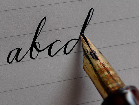
I’ve always found it fascinating, that Waterman color-coded their nibs. Richard Binder’s site, richardspens.com, features an ad from 1927 headlined “Pick your pen point by color.”Â
It’s a concept alien to the one-ballpen-fits-all generation, and the what’s-a-ballpen generation just around the bend. It doesn’t have to be. Writing by hand is one of the last bastions of daily beauty. A scribbled thank you note still feels more sincere than a printed card. I will most likely have seizures without a data signal, but a keyboard, no matter how comfortable I am with one, has no soul.
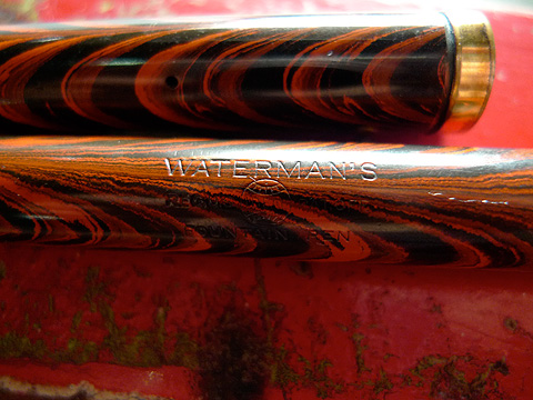
Waterman survives to this day. I have two modern Watermans, a Carene and a Charleston. (Drop by National Bookstore in the old Greenbelt and see if they’re still on sale. Last week, the orange Carene was available for P6,600, which is a retail bargain.)Â
If I were to choose, Â vintage Waterman pens win.

As people’s writing needs changed – from personal correspondence to business – and as ballpoints became everyone’s writing tool, fountain pen nibs changed. Many vintage nibs from the earlier half of the 20th century feel soft and yielding. This contributes to the expressiveness of the lines they produce. Expressiveness, for me, lies in line variation and ink shading.
Modern nibs are stiff, like ballpoints. They produce lines of consistent width and tone. They have their uses, of course. Cross-hatching needs a very fine, consistent line. I think modern Japanese nibs from Sailor, Platinum and Pilot are perfect for that. My check-signing pen is a Pilot. Well, a Namiki, but they’re the same brand anyway.Â
I doodle while I think. The Pink nib makes my doodles look artful.
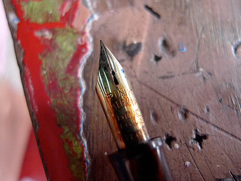
Even among Pink nibs, there are ranges of flexibility. I’m quite fortunate to have one that writes extra-fine, lightly, and double-broad with pressure. Resilience is an admirable trait – in people, and in nibs.
