UPDATE:
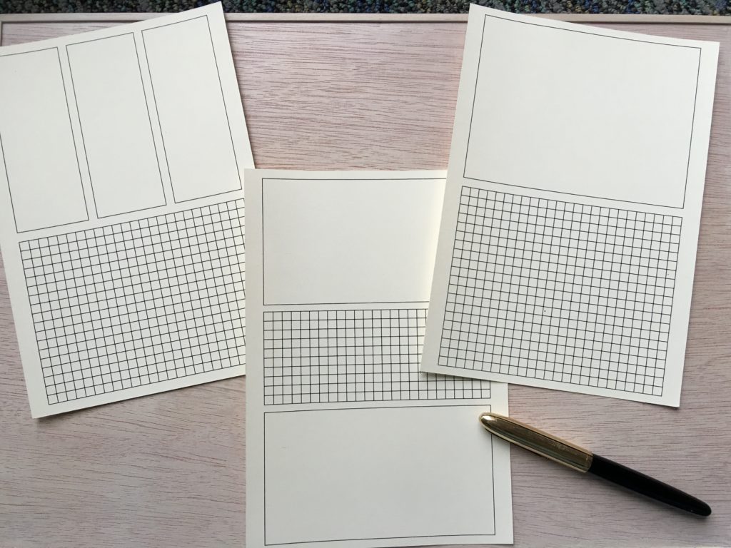
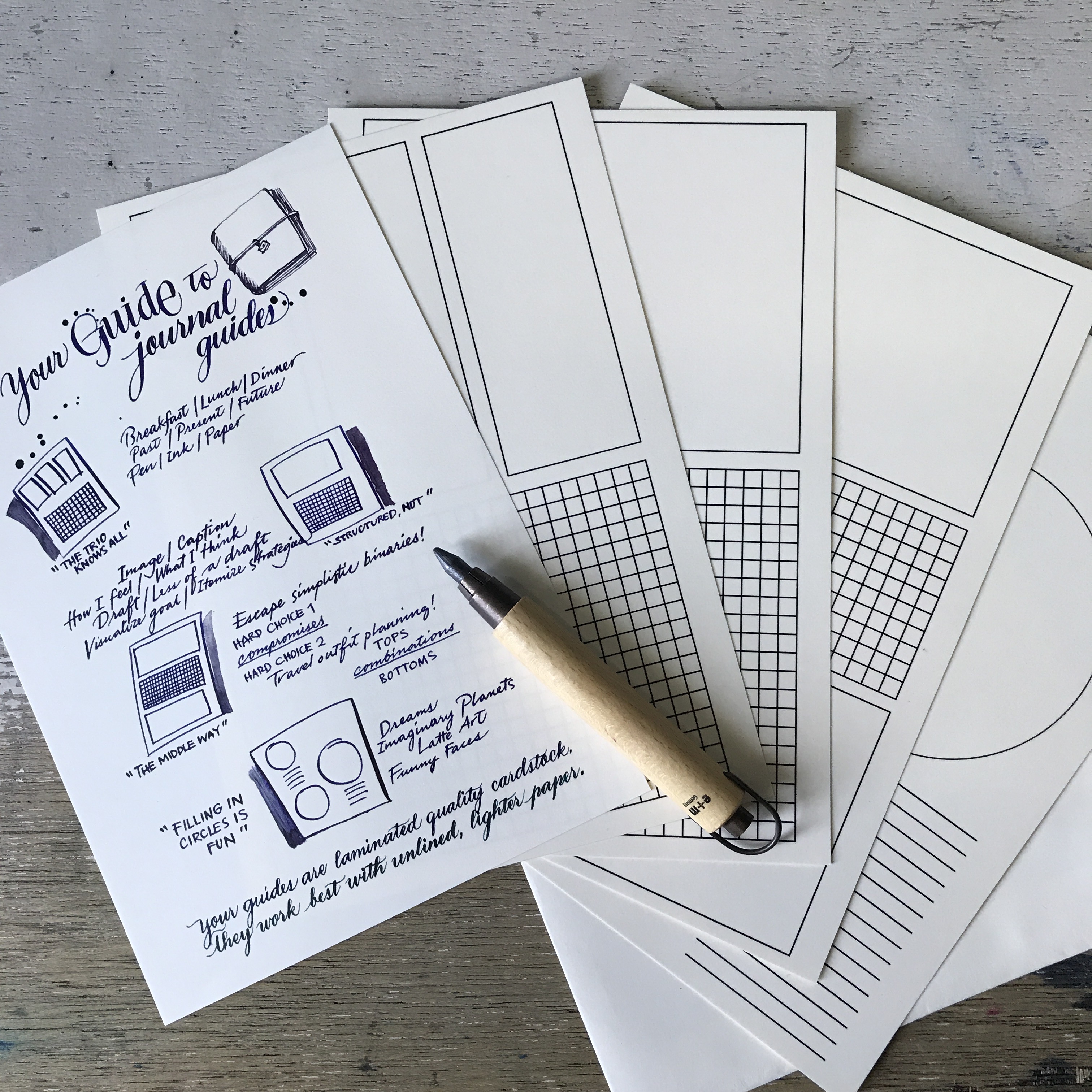
A5 Journal Guides are available at Common Room (for Manila-based peeps) and now online at Vanness! You get a suggestions sheet, and four guides printed on thick, high-quality, laminated cardstock. (I can try other materials in the future, but this feels better under a thin sheet, for some reason.)
And now on to the original blog post:
The blank page. Intimidating, yet full of hope. I’m a fan, but understand how intimidating emptiness can be. My usual coping mechanism is to hazard a beginning – ink spatters, a dash of watercolor, smudges of graphite, the word “the” – and then the rest settles into place.
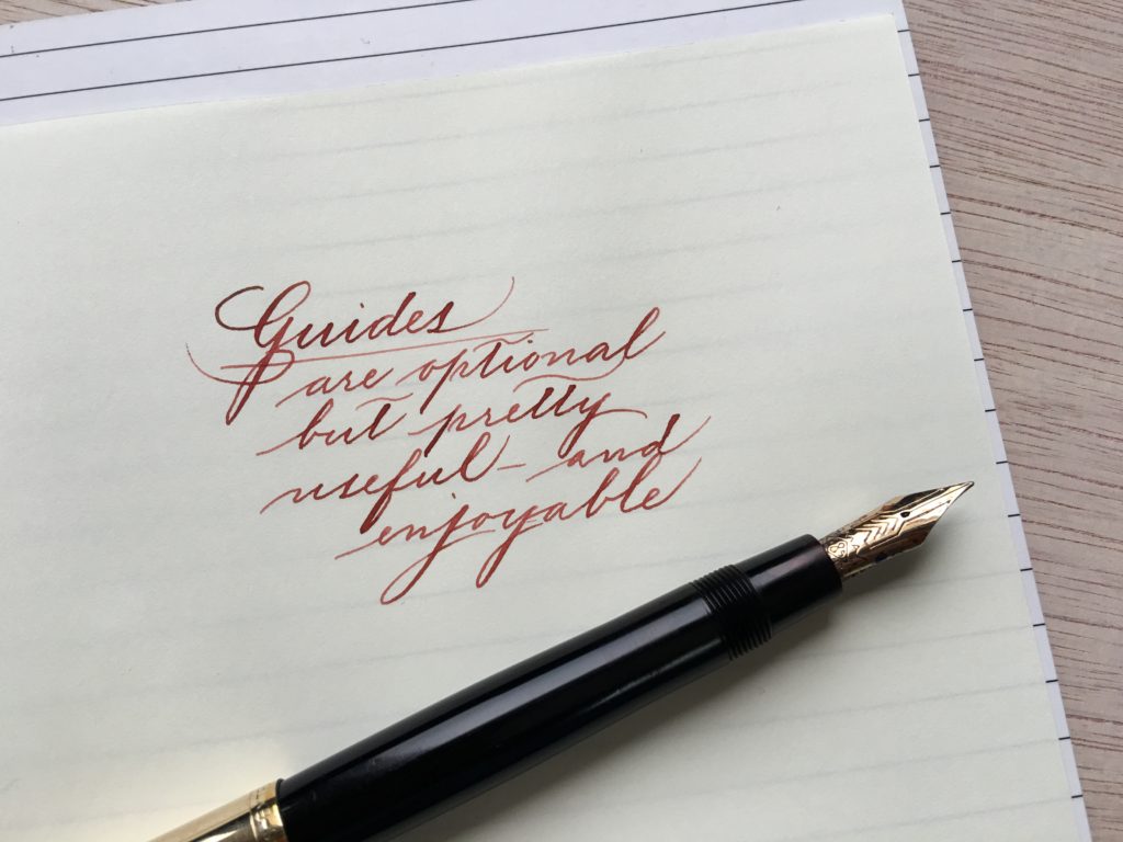
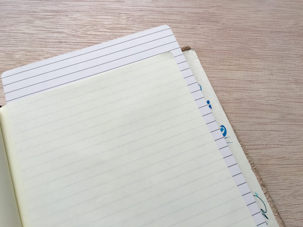
Guides exist to neaten handwriting and provide order, with lines and grids.
Journaling, though, is more than note-taking. You can organize memories, reflect on the day, plan grand futures, scribble “What a happy ink!” over and over again. A journal is no longer bound by time and day; you can fill it with loop-de-loops, washi tape, photo stickers, utterly delightful nonsense. It can be full of import, your intellectual legacy. It can be pure fiction. What it cannot be – John Cage to the contrary – is blank.
These A5 journal guides have just enough structure to inspire, and leave just enough to the imagination. I was inspired by Tarot card and rune spreads, which aid storytelling through the use of structures that can be interpreted differently depending on the question asked. Journaling prompts usually come as questions or instructions. Think of these as structure prompts: ways to visualize your thought process in ways that help you be more insightful, and make the most out of your journaling time.
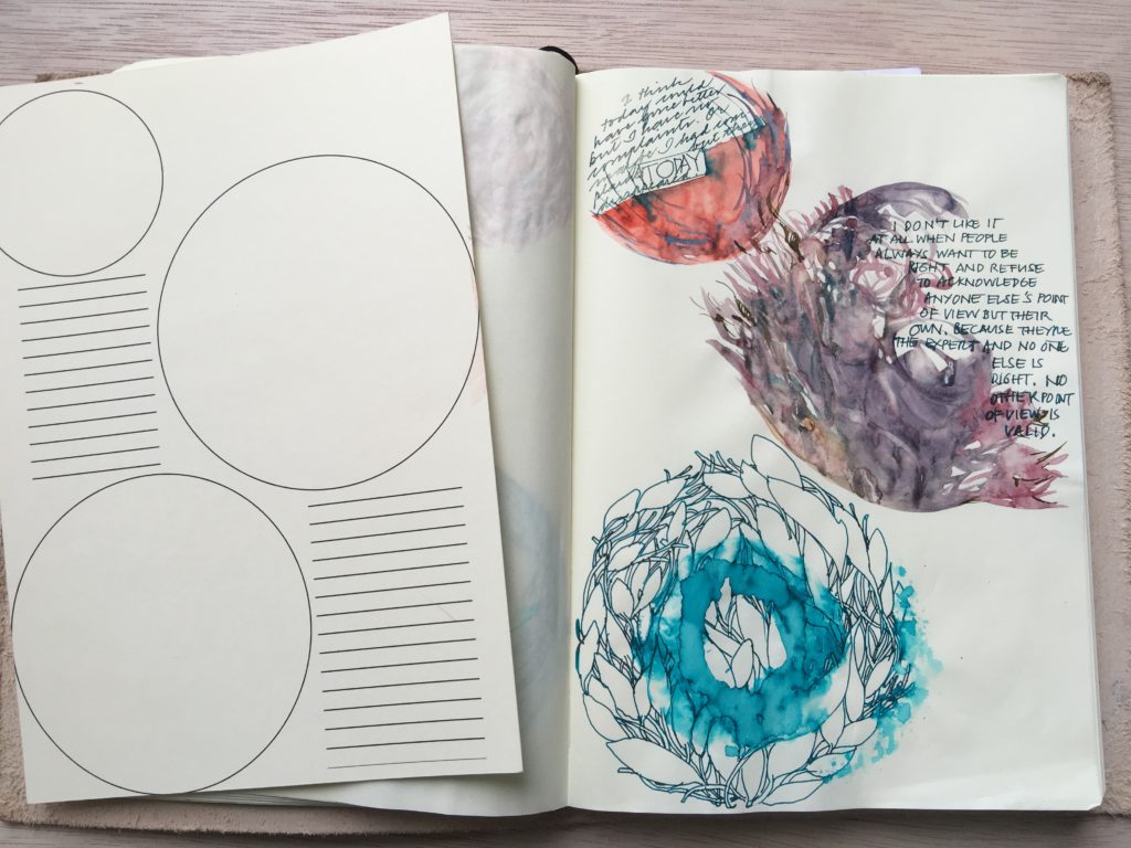
I designed this one to be silly. But it might not be as silly as it looks, after all.
JOURNAL GUIDE: THREE-AND-ONE
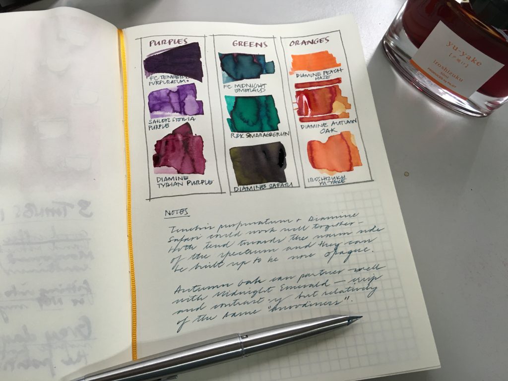
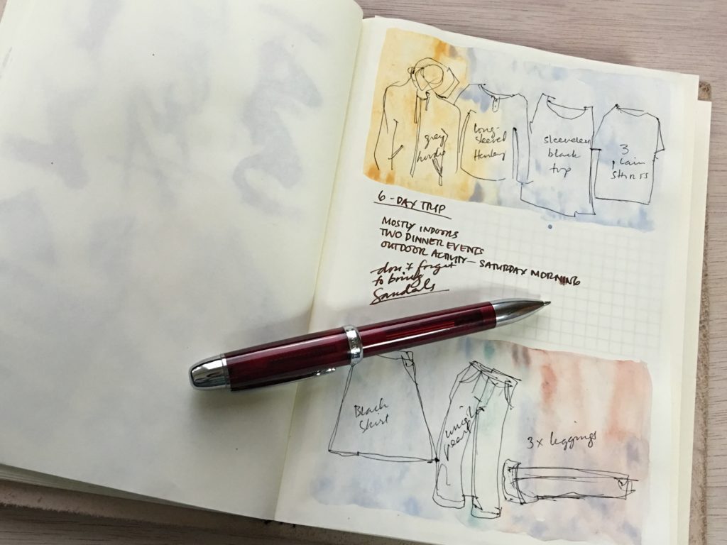
This guide is based on the three-card spread. Past, present, future. Physical, emotional, spiritual. Maiden, Mother, Crone. Do this, do that, do nothing. Short-term, mid-term, long-term goals. Three things I’m grateful for.
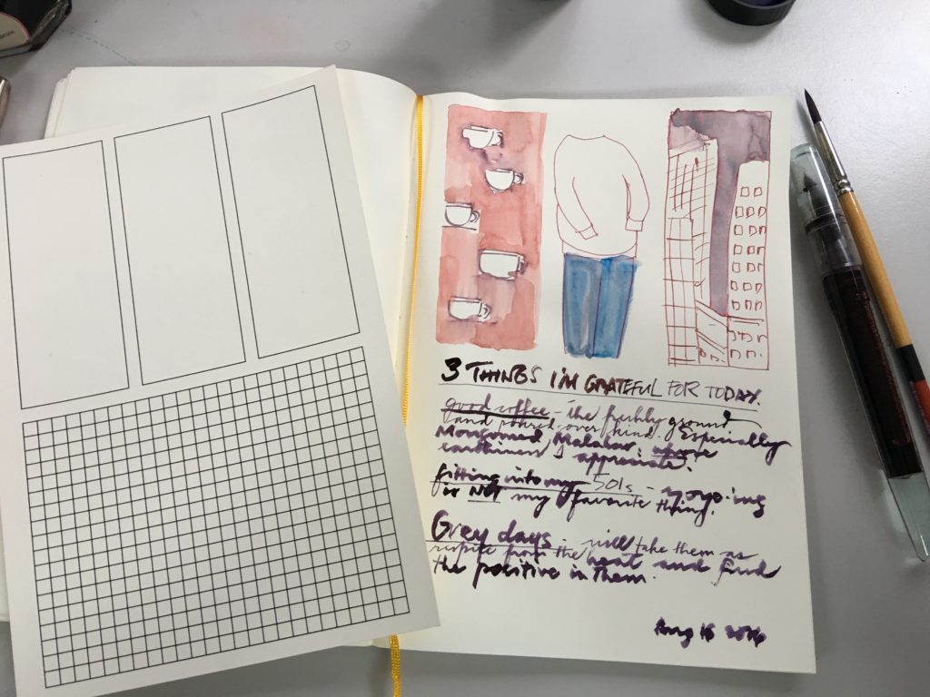
Ink notes: complementary colors. (You can also do this for a set of primaries, or warm/cool/neutral, or pale/mid/dark.)
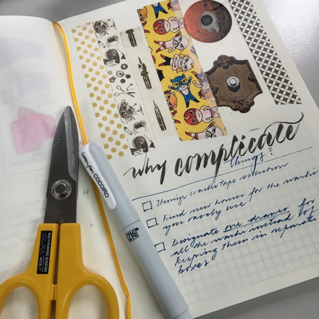
What about a washi tape collection organizing guide?
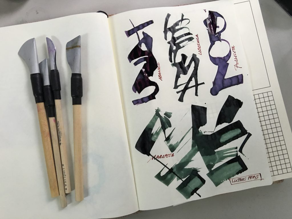
Or even a record of lettering samples.
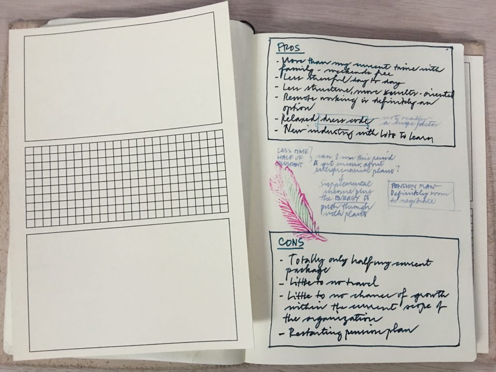
We’re all familiar with writing down pros and cons in two side-by-side columns. The side-by-side column structure is good for straightforward comparisons but doesn’t encourage insight into the middle ground. What if the answer is neither purely for or against? What if there are great ideas or solutions that lie somewhere between?
JOURNAL GUIDE: THE MIDDLE WAY
This guide is meant for richer pairing and comparisons. Here’s what a pros-and-cons process looks like. The middle space encourages actively searching for points where pros and cons can meet or be resolved differently.
Sometimes, life’s pros and cons are really just tops and bottoms.
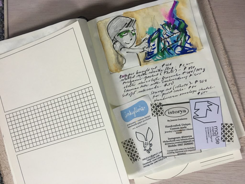
You don’t have to use this for pairs. You can also think of this guide as drawers in a cabinet. Below, it’s used to put together a price list, a doodle, and business cards after a trip to a Sunday bazaar.
JOURNAL GUIDE: THE POSTCARD
The postcard layout just divides the page into structured and free-flowing.
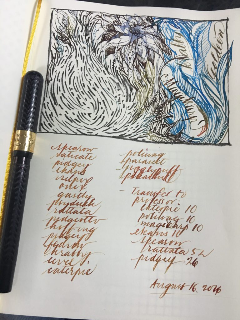
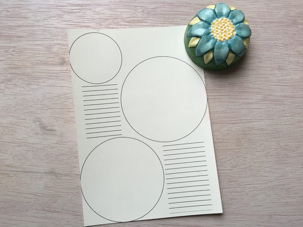
JOURNAL GUIDE: WORLDS
Let’s go back to the silly guide, the one with circles. As it turned out, this was the most conducive to doodling.
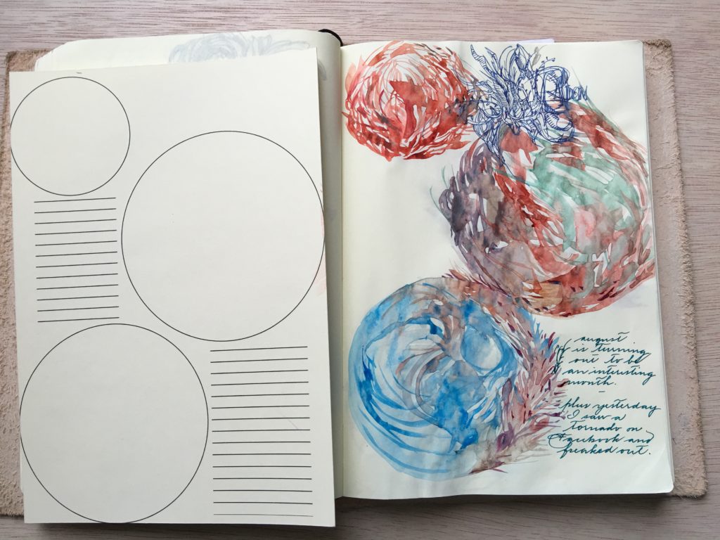
I’m thinking of having these printed on soft plastic (for comfortable writing) and selling them as a set together with a journaling guide. What do you think? I’d love your feedback.
(Thanks to Jake and Marnie for helping me with the prototypes!)