The music set had a blue box, the flower set has green. A flower stamp takes the place of the G clef.
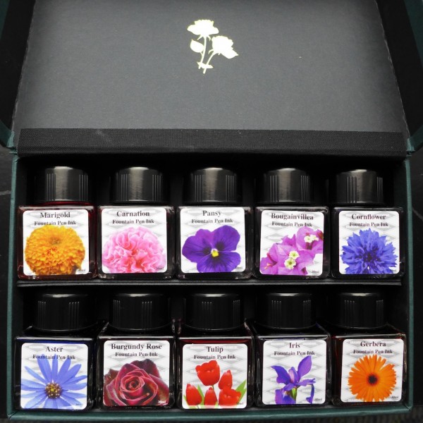
All green on the outside, but not a single green in the bunch! If you have green ink, you can add stems to your flower doodles.
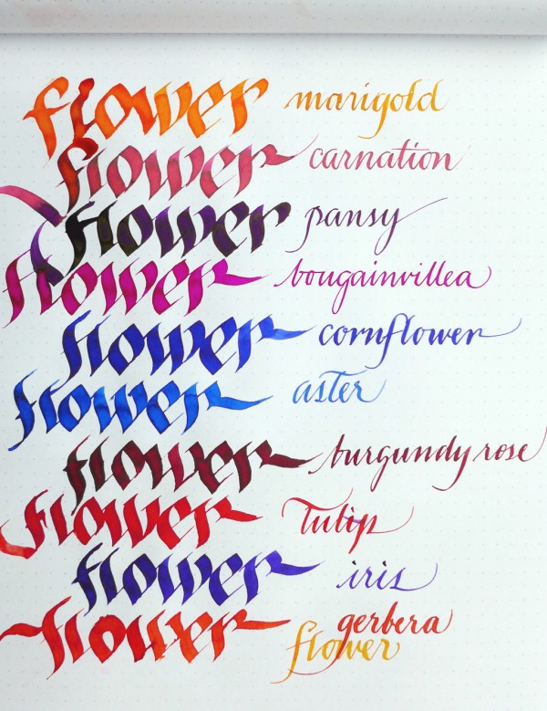
An ink’s appearance can change dramatically depending on the nib and paper. I used dip pens for these samples – if your pen has a fine nib with dry to medium flow, imagine the ink a shade lighter. The paper is Clairefontaine Graf It. Marigold and Gerbera, on the yellow-orange side of the spectrum, flow sparsely and are best used in pens with generous flow. Pansy, Cornflower, Aster, and Iris, on the blue-violet side, are well-behaved. Pansy has a greenish-gold sheen which doesn’t show in the photo. Cornflower shades well. Carnation is an unusual pink, and deserves its own release, just like Handel from the music collection. Bougainvillea is slightly deeper than Diamine’s Deep Magenta. Burgundy Rose is gothic. Tulip is a happy, bright red with strong orange undertones when smeared.
This is not a basic set. No green, no brown, no gray, no almost-black. It’s not value for money, in that sense. Then again these tiny joys have their own metric, and on a rainy, gloomy day like today, tiny joys are invaluable.
(Peter, who distributes Diamine locally, also carries Bexley pens. Join fpn-p.org and say hi to him!)